GIS Infrastructure for Management (JHU AAP SPRING 2025)

cartography, Graphics

Midterm project: “All K-12 Schools, both public and private. Suggest other locations for K-12 schools near the JHU Homewood campus.”

To view the full paper, click the hyperlinked title:

Final Project: “Develop a GIS vision for a local government, company or higher education institution, that doesn’t currently have one, anywhere in the State of Maryland.  Research the required components to put it into place and create a proposed starting budget, governance document and assigned staff.   Create a spatial overlay to perform initial analysis of the chosen location.”

To view the full paper, click the hyperlinked title below:

WHY AM I FASCINATED WITH THE ACT OF CAPTURING IMAGES AT ANYTIME AND ANYPLACE?

Uncategorized

The word “photography” was created from the Greek roots φωτός (phōtós), genitive of φῶς (phōs), “light” and γραφή (graphé) “representation by means of lines” or “drawing”, together meaning “drawing with light”.

I go to Chile, take a wide shot of the beach, look at the result, and see a vivid yet lifeless image. It’s just frozen and imbuing colors and light. Only my eyes and brain find it appealing, but my heart is beating the same rhythm and pace – unaffected.

Everywhere I go, I’m “drawing with light”. Only capturing the things that appeals to me. That old-fashioned saying of how photography is about capturing the moment in time when in reality, you’re just freezing the image and given the gift of creative release and manipulation. There’s no life to an image after freezing the frame. It’s just still and no breath. So easy to manipulate and translate it in any language one may prefer. It’s a powerful tool that can be easily taken for granted depending on whose eyes are capturing the moment and wants to freeze it.

GEOG 323.180 – Cartography and Graphics

Uncategorized

Thoughts

Briefly describe what you learned from class that surprised you.  What challenged you and how did you meet the challenge? The thing that surprised me the most was that the whole semester, we had to use Adobe Illustrator (AI) for map-making. I didn’t understand at first how the application relates to map-making but after having few experiences, I could understand why it’s useful in cartography. The challenge for me during the whole semester was using AI. I have never used it for graphic designs and the first time I worked with the application, I got adjusted to it for a while. I’m really thankful that my professor provided a beginner’s guide on how to use it and always gives us instructions which made my experience better.

How did this learning (mapping skills/map design) relate to the things you are learning in your other courses? Most of my courses didn’t require or get involved with mapping skills or map design. However, for my Climotology class, I was assigned to make infographics. The skills with AI that I acquired from GEOG 323 helped me to make neat and detailed infographics.

What is the most important criteria to you in designing a good map?  Explain why. I believe that hierarchical organization is an important criteria in designing a good map. Some types of features will be seen as more important than other kinds of features, and some features will seem more important than other features of the same type. Some page elements (e.g., the map) will seem more important than others (e.g., the title or legend). This visual layering of information within the map and on the page helps readers focus on what is important and lets them identify patterns.

Cartogram

cartography, Graphics

The purpose of this assignment is “to produce a color, noncontiguous
cartogram of the Hispanic or Latino Population in the United States based on the [latest] US Census data.”

Lab9_RaoelisonFitia

Compare the Hispanic Population Cartogram to the Standard U.S. Map:

  • Which state has the largest Hispanic population and which state has the smallest population?  How can you tell?
    • The state that has the largest Hispanic Population is California and the state that has the smallest Hispanic Population is Vermont. Based on the exploding size compared to Texas and Florida (which are also big), California has the largest population compared to the rest of the country. Vermont has over 600,000 total persons but the Hispanic population (less than 10,000) is small compared to the total.
  • Find Maryland on the cartogram.  Does it appear smaller or larger relative to its size on the standard map?
    • It’s larger because it has over 470,000 Hispanic persons/10,000 sq. mi (which means 1 in 47 in 100 miles squared) compared to other states like Vermont, Wyoming, etc.
  • Based on the cartogram you created, which three states would you conclude have the most Hispanic representatives?
    • California, Texas, and Florida
  • In conclusion, do you think the cartogram effectively convey the underlying message, in this case Hispanic population, to the audience?  Explain.
    • Yes. The enlargement/shrinking size and color shading of the symbols is direct to the point and tells the map reader right away the information they need to know.

Proportional Symbol Mapping

Uncategorized

“The purpose of this lab is to “use absolute scaling, using ArcMap’s terminology, is the proportional symbol map . . . [and learn how to] adjust the minimum symbol size for symbol scaling, specify the number of symbols to display in the legend, and create a 3-D or pictorial proportional symbol map.”

Lab8_RaoelisonFitia

With the data set you chose, what challenged you the most when mapping proportional symbols and how did you meet the challenge? Scaling the proportional symbols based on the data from Eurostat. If I choose a scaling factor that is too small, it would be more difficult for the map reader to see patterns in the data, while if the scaling factor is too large, the map reader would be be presented with many overlapping symbols, which will also make it difficult to see patterns in the data.

When comparing the symbolization shown on the map with the raw data (Excel
spreadsheet) obtained from the Eurostat, did your map effectively and accurately convey the underlying message to the audience? Why or why not? No, because with countries that has a value of 1,000, the size of the symbol is too small and weak for the map reader to see. However, map readers can see that Germany, France and the UK are the leading European countries with the most transported goods by air and from this information, they can assume it’s due to their advanced technologies and resources.

Dot Density

Uncategorized

“The main purpose of dot density mapping is to communicate variation in spatial density. [We] will explore dot density mapping using the same data set (2014 population data) obtained from the previous lab.”

Lab7_RaoelisonFitia

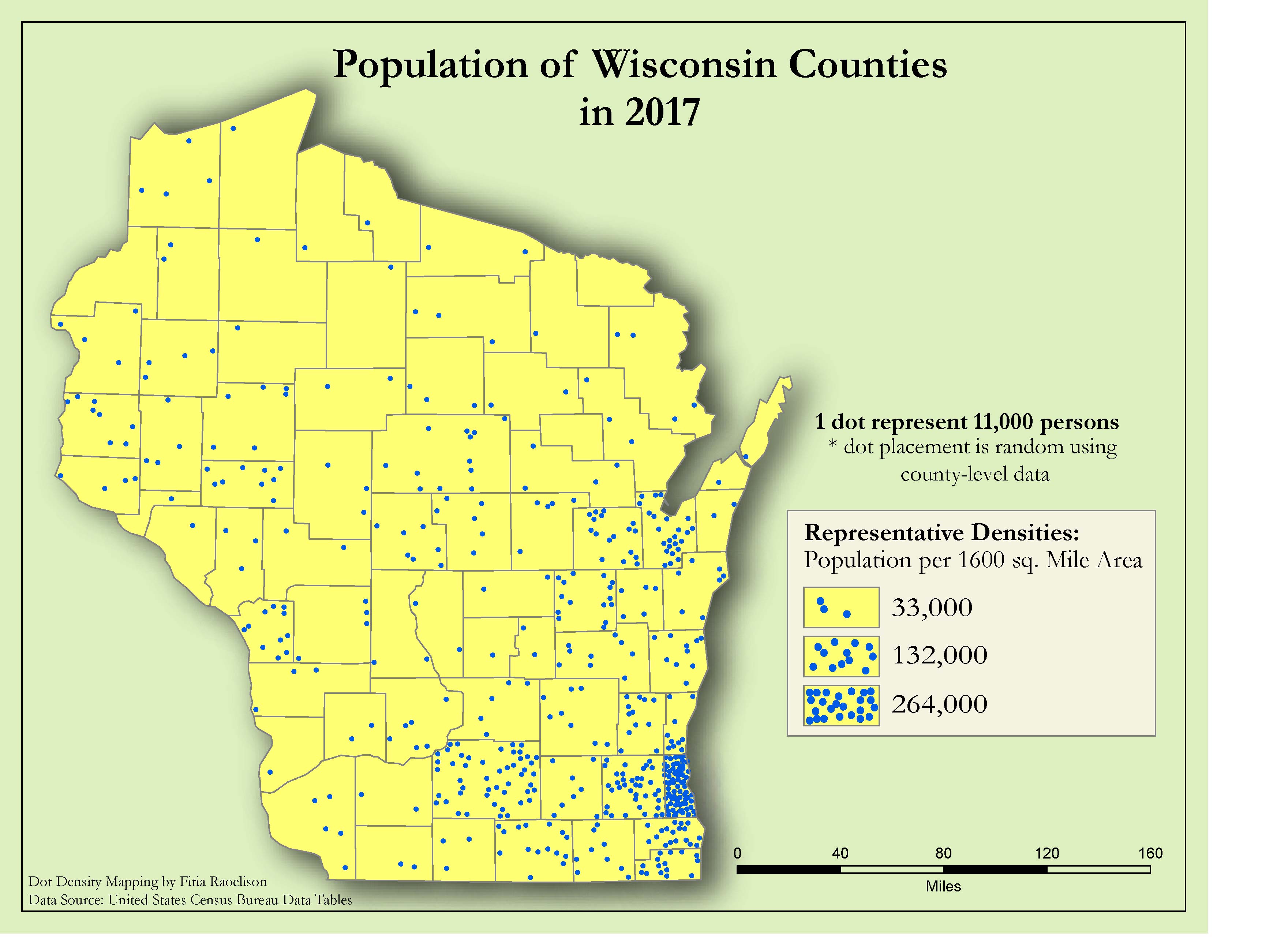
What dot size and units per dot did you use?  Look at the map you created and explain whether your map effectively conveys an underlying message (population density) to the audience.  If not, what would you change and how could you correct it? I used 1 dot which represent 11,000 persons at random placement using county-level data. By looking at the map, using this dot size allows the data to look evenly spread out across the state. According the map, there are more people living near the coast where it’s touching Lake Michigan.

Explain the pattern you see on the dot density map.  Is the pattern shown on the dot density map similar to any of those created by the choropleth technique? Further south, there are dots appearing which means larger population and if we go farther north, most counties have at least three dots, which means a small population. The pattern on the map is similar to those created by chloropleth technique because chloropleth mapping displays divided geographical areas or regions that are colored, shaded or patterned in relation to a data variable

What problems did you encounter while assigning a dot value for phenomenon with a very large data range? It was difficult to find a good dot value that could give the map a good balance between the values in each county. If I had used a small dot value less than 10,000 persons, the most populated county would’ve blended together and hard to distinguish. If I had used a larger dot value greater 15,000 persons, the dots would appear to be spaced far part in dense areas and even more so in sparse areas. To fix this, I had to find a good value between 10,000 and 15,000 that could give that balance.

Does the political unit control the dot placement?  Once the county lines are removed, does the “boundary effect” still appear on your map? Yes. These boundaries may have been devised only for enumeration purposes, thus they should not be used to dictate the location of the dots.  For example, population settlements occur irrespective of political boundaries, and under these circumstances, dots should be placed on or very near the boundary line.  Doing otherwise would result in a map with areas that are clearly separated by white lines.


Data Classification & Chloropleth Mapping

cartography, Graphics

The objective of this project is to “investigate various options for classifying quantitative data and create four different choropleth maps of population data by county . . . using the 2014 population data [obtained] from the U.S. Census Bureau.”

Lab6_RaoelisonFitia

Challenges/Disadvantages: 

  • Map title – Since all maps display population density, I could’ve used different classification methods, map title could be, “The effects of Data Classification on Choropleth Maps” and add a subtitle: “2017 Wisconsin Population Density by County” to the layout.
  • Legend seems to contradict with the values.
  • Maps are distorted thus unclear projection.
  • Did not use standardized data for choropleth mapping (i.e., Population density rather than total population). Instead, I used raw data for choropleth mapping.
  • The word “Legend” was not removed and the area unit for density was not specified.
  • Increase the legend & font size. Specify the area unit for density.
  • If I scaled the maps properly, I would  have more space available on the layout.
  • Did not include a brief description of each classification method to emphasize map purpose and to help the audience understand how to interpret the map.

Comparing these four classification methods, I see a difference between the divide in attribute values and the value range. For example, with Quantile, the values are linear, the features are grouped in equal numbers and the distortion of the map can determine how many class values can you use. It is similar to Equal Interval however, it divides the range of attribute values into equal-sized subranges, which allows the user to specify the number of intervals, and ArcGIS can automatically determine the class breaks based on the value range (e.g 0–100, 101–200, and 201–300). If I had not used standardized data, it would’ve been easier for me to determine which classification best represent the data of map well. If it were only raw data, I would say Natural Breaks  because the classes were divided in a way whose boundaries are set where there are relatively big differences in the data values. This project was hard for me to understand at first because I wasn’t sure I should have modified the values for each classification method, hence why each map looks distorted and doesn’t seem to match the data.

Map Lettering

Uncategorized

The objective of this lab is to “reinforce the ideas of typography.” I was set to correctly letter a map of the northwestern United States, “place the following names on the
map . . . [and] arrange the various map elements so they present the data in a cohesive, well-organized map that emphasizes good map design and organization.”

Lab4_RaoelisonFitia

Challenges:  The texts were all angled at 343 degrees and looked normal as I zoomed in. But when I zoomed out to get the full view of the image, the letters of each text seemed unaligned. Scaling the texts in a readable state and making sure it part of it is not completely overlapped by other elements.

Advantages: Clean layout. Text orientation.

Certain things I could’ve done to improve the design:

  • Establish visual hierarchy for the layout, e.g., use different font (size) for capital city to emphasize its importance; use gray (instead of black) lines for graticules to push it to the background.
  • Use all caps for county names and keep the same size as possible (e.g., Clallam and Jefferson). 
  • Keep the spacing between dot and city name consistent (e.g., Kent, Yamhill)
  • Reposition the text (Washington) or reduce font size; there was too much overlapping with other element on the map
  • Font could have been smaller. 
  • Place river’s name above the river; use italic font.

Overall, this lab was interesting for me because it I was more focused on the composition and organization of each element on the map. I’ve finally got to understand the use of white background that is aligned behind texts that are overlapped with other elements. This method creates a balance in the composition of the map. This lab allowed me to use my abilities to be creative and strategic on how to keep the harmony & balance between the texts and the map elements.