

The objective of this lab is to “reinforce the ideas of typography.” I was set to correctly letter a map of the northwestern United States, “place the following names on the
map . . . [and] arrange the various map elements so they present the data in a cohesive, well-organized map that emphasizes good map design and organization.”
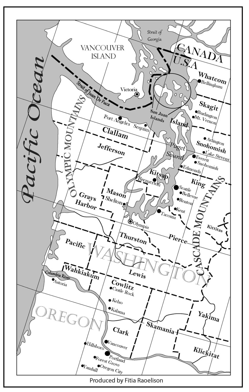
Challenges: The texts were all angled at 343 degrees and looked normal as I zoomed in. But when I zoomed out to get the full view of the image, the letters of each text seemed unaligned. Scaling the texts in a readable state and making sure it part of it is not completely overlapped by other elements.
Advantages: Clean layout. Text orientation.
Certain things I could’ve done to improve the design:
- Establish visual hierarchy for the layout, e.g., use different font (size) for capital city to emphasize its importance; use gray (instead of black) lines for graticules to push it to the background.
- Use all caps for county names and keep the same size as possible (e.g., Clallam and Jefferson).
- Keep the spacing between dot and city name consistent (e.g., Kent, Yamhill).
- Reposition the text (Washington) or reduce font size; there was too much overlapping with other element on the map.
- Font could have been smaller.
- Place river’s name above the river; use italic font.
Overall, this lab was interesting for me because it I was more focused on the composition and organization of each element on the map. I’ve finally got to understand the use of white background that is aligned behind texts that are overlapped with other elements. This method creates a balance in the composition of the map. This lab allowed me to use my abilities to be creative and strategic on how to keep the harmony & balance between the texts and the map elements.
