

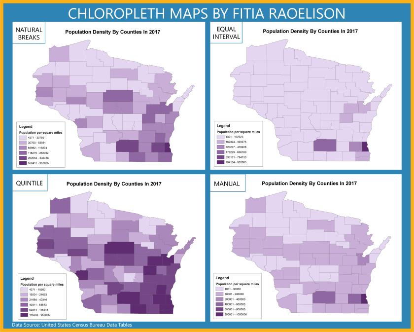
The objective of this project is to “investigate various options for classifying quantitative data and create four different choropleth maps of population data by county . . . using the 2014 population data [obtained] from the U.S. Census Bureau.”
Challenges/Disadvantages:
- Map title – Since all maps display population density, I could’ve used different classification methods, map title could be, “The effects of Data Classification on Choropleth Maps” and add a subtitle: “2017 Wisconsin Population Density by County” to the layout.
- Legend seems to contradict with the values.
- Maps are distorted thus unclear projection.
- Did not use standardized data for choropleth mapping (i.e., Population density rather than total population). Instead, I used raw data for choropleth mapping.
- The word “Legend” was not removed and the area unit for density was not specified.
- Increase the legend & font size. Specify the area unit for density.
- If I scaled the maps properly, I would have more space available on the layout.
- Did not include a brief description of each classification method to emphasize map purpose and to help the audience understand how to interpret the map.
Comparing these four classification methods, I see a difference between the divide in attribute values and the value range. For example, with Quantile, the values are linear, the features are grouped in equal numbers and the distortion of the map can determine how many class values can you use. It is similar to Equal Interval however, it divides the range of attribute values into equal-sized subranges, which allows the user to specify the number of intervals, and ArcGIS can automatically determine the class breaks based on the value range (e.g 0–100, 101–200, and 201–300). If I had not used standardized data, it would’ve been easier for me to determine which classification best represent the data of map well. If it were only raw data, I would say Natural Breaks because the classes were divided in a way whose boundaries are set where there are relatively big differences in the data values. This project was hard for me to understand at first because I wasn’t sure I should have modified the values for each classification method, hence why each map looks distorted and doesn’t seem to match the data.
