

My objective for this project was to make a graphic analysis of a graphic design I was given. The artwork I analyzed is an infograph called “The History of Money”. The purpose of this project is “to reinforce the concept of visual hierarchy in cartographic design and identify visual hierarchy of elements in the assigned graphic and create a poster to illustrate our analysis”.

| Assigned Graphic | Description & Analysis |
| DESCRIPTION
Describe the graphic that you are analyzing. What it looks like? What is an underlying message that the author communicates to the audience? |
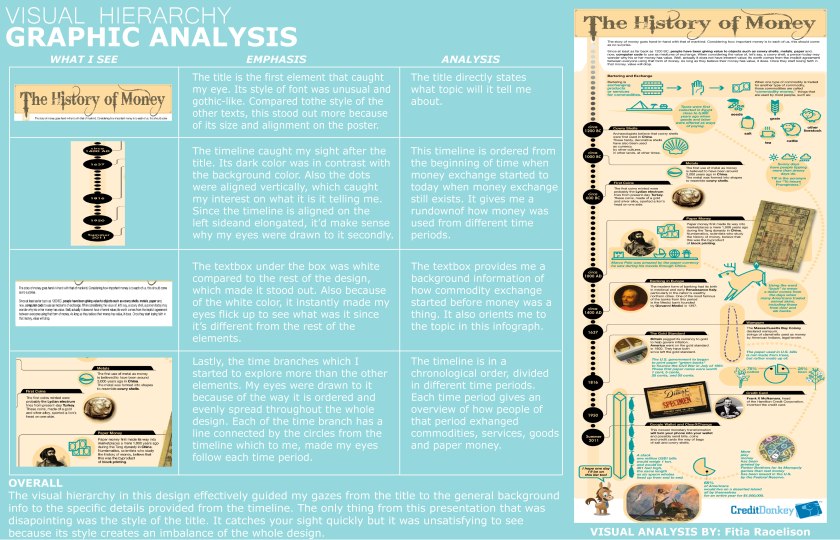
The graphic is laid out like an elongated poster. Given by the title of the poster, it focuses on the subject of the history of money. It provided a timeline of how money exchange came to be. |
| PERSONAL
What specifically do you like / dislike about this presentation? |
Like: the timeline of how money came to be. It flows well and give clear details.
Dislike: I felt that the style of the title on the top did not match or embody the subject of the poster very well. |
| SYMBOLISM
What kind of symbolism or meaning does this image have? Describe the feelings or emotions you get from viewing this image |
This image is an infograph that is giving the audience a rundown of how money started a long time ago. It takes us back in time as we explore each detail of the timeline. |
| TYPE OF MEDIA
What media have the author used to create this graphic? Photograph, print, hand drawn, collage, ink, paint, etc. |
The author used a graphic design software to create the elements altogether in a poster layout. |
| VISUAL HIERARCHY EMPHASIS
Where is your eye drawn 1st? Where is your eye drawn 2nd? Where is your eye drawn 3rd? Explain why … |
Focal Point – 1st – TITLE: History of Money. It was the first thing I was drawn to since it was on the top and the typeface was a contrast of the poster.
Secondary – 2nd – Vertical timeline on the left side of the poster. I was drawn to this aspect after the title because of its dark color and the way the dots stand out in a neutral background color.
Tertiary – 3rd – The white box under the the title. The color white stood out more than the others. |
| TYPOGRAPHY
Describe the use of type/fonts in this image. |
For the title, it’s using a gothic typeface. The rest are using a modern sans-serif typeface. |
| COLOR
Describe how did the author made use of COLOR to create emotion, draw attention, etc? |
The author mixed the colors really well on top of the neutral background color. The author also found a good balance in using the amount of color for certain elements which makes it easy on the eye. |
| ELEMENTS OF DESIGN
List and describe the visual variables prominent in this image – (lines, shapes, texture, space, color, size, etc.) |
The neutral background color and the blue color on some of the elements gives the poster a nice, smooth blend. The size of each elements are well-balanced and are not taking up too much space. |
| ADDITIONAL COMMENT | The style of the title is the only element that unsatisfying to the eye since it does not blend well with the style of other elements. |
I made a graphic analysis of the original artwork and expressed my opinions and observations on it.
The process of making a graphic analysis was challenging. There was a difficulty in making graphic design decisions: “Do the colors complement each other? Are these texts well-aligned? Am I taking up too much space in this area? Are the texts readable from a certain distance?”. These are all questions we always consider during a design-making process.
One my biggest strengths in this project was choosing light blue color as the background for the poster. The fonts (body texts) were not overcrowded which makes it easy for the audience’s eyes. Another strength is that I was able to spread the images evenly over the poster, thus leading the viewer’s eye through the material. I was also able to establish a convention with font sizes and styles that lets viewer easily recognize the order of importance of information in the poster.
Despite the amount of good qualities I put forth into this project, there were some things I didn’t consider that could’ve made this graphic more strong and neat. The dimensions of this artwork was incorrectly formatted, which distorted some of the images. The color of the texts were not strong enough to enhance the contrast of the design.
Overall, this project was one of my favorites because it allowed me to explore freely with the features and tools in Adobe Illustrator. It also allowed me to learn more about graphic design.
