

I was given a file that contained map elements and data that needed to be arranged in Adobe Illustrator. My objective was to construct a well-balanced map on Illustrator by using the map elements and data I was given, and organize them neatly.
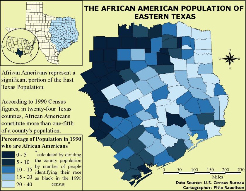 The first thing I decided to change in one of the elements was the color scheme of the map. Initially, the Texas map had different colors that I felt did not reflect well with the data on the legend so I chose a different color scheme that can reflect the numbers. However, my choice of color scheme became a drawback as the two dark colors look closely similar to each other that it is difficult to distinguish between the two. This design choice made it hard for the viewer to read and understand the map.
In this project, a neatline 7′ x 9′ was required to make this map. I felt that the neatline was helpful and beneficial as it compresses the space needed to be filled in a map. It helped me resize and arrange the elements faster.
One of my strengths in this map was resizing the inset maps and aligning properly to create a good and logical connection with the main map. Another strength was making use of the space and made sure I didn’t leave a big empty space that could mess with the balance of the map.
Despite the strengths that was shown well in this project, it also brought disadvantage to the readers. There were some qualities I didn’t consider while making this map which were adjusting the spacing between the colored boxes in the legend and making the scale bar proportional to the main map in order to bring balance. I also used up a lot of space which makes it hard for the reader to rest their eyes on the map.
Overall, this project was a good learning experience and taught me the importance of cartography in the geography field which is to create maps as effective communication tools for the audience to see, read, and understand.
